
Landing Page Optimization for Affiliate Offers: 15 Elements That Boost Conversion Rates
Fifteen practical landing page elements that turn affiliate clicks into conversions — from headlines and social proof to mobile speed, tracking, and CTA design.

Fifteen practical landing page elements that turn affiliate clicks into conversions — from headlines and social proof to mobile speed, tracking, and CTA design
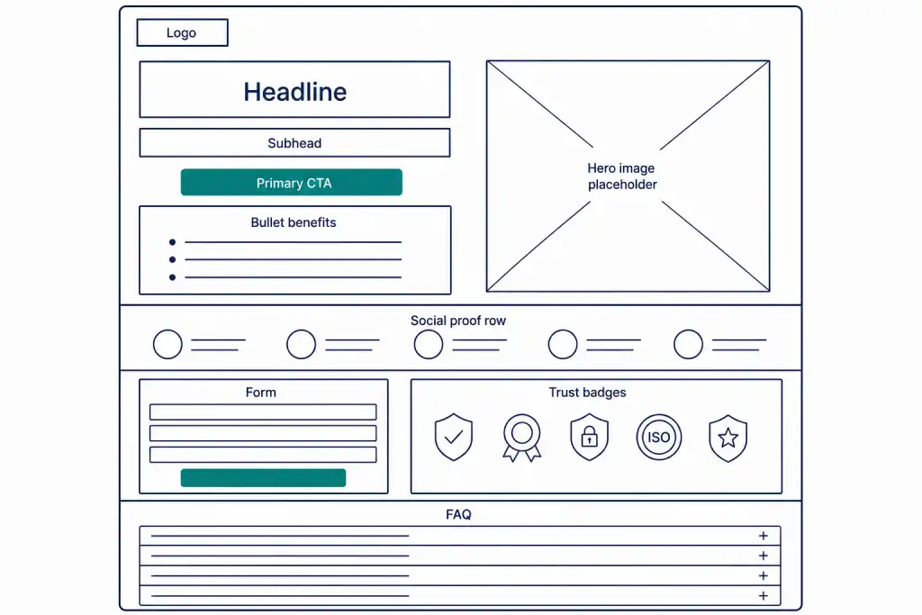
Affiliate clicks are expensive — whether you buy them through partners or earn them through content. When those clicks land on a weak page, you pay twice: once in commission or ad spend, and again in lost revenue. Landing page optimization for affiliate offers is the discipline of turning that traffic into measurable conversions without guessing which visual tweak "felt" better.
If you run an affiliate program, your partners' traffic quality only matters if the destination page converts. If you promote offers as a publisher, the same rule applies: strong media buying or SEO cannot save a page that confuses visitors, loads slowly, or fails to track the right event. This guide covers fifteen concrete elements you can audit and improve — plus a framework for testing them without inventing fake benchmarks.
You do not need a redesign every month. You need a checklist, clear priorities, and reporting that ties page changes to EPC and conversion rate. Terms like CR, EPC, and postback appear throughout; if your team is new to the language, keep the affiliate marketing glossary open while you brief designers and media partners.
Quick Summary
- Optimize for one primary conversion action per page — signup, purchase, deposit, or lead — and measure it with reliable tracking.
- The highest-impact elements are usually headline clarity, CTA visibility, message match from the ad or affiliate link, and mobile speed.
- Trust signals, social proof, and offer specifics reduce friction; clutter and competing CTAs increase bounce.
- Test one major change at a time and judge results by CR and EPC, not opinion.
- Affiliate landing pages must preserve attribution — broken pixels and missing sub-IDs make good pages look bad.
- Treat this guide as a foundation for broader Conversion Rate Optimization (CRO) for Affiliate Marketers work across your funnel.
What Landing Page Optimization Means for Affiliate Offers
A landing page for an affiliate offer is any dedicated page where traffic from a partner link, smart link, or campaign URL is expected to convert. It may be your product homepage, a branded promo page, a pre-lander, or a comparison page. Optimization means systematically improving the elements that influence whether a visitor completes the tracked action.
Unlike brand storytelling pages, affiliate landers must satisfy three stakeholders at once: the visitor (clear value), the advertiser or merchant (compliant claims), and the affiliate (fair attribution). That is why Affiliate Tracking Methods (And Where They Actually Work) belong in the same conversation as design — a beautiful page with a broken conversion pixel is not optimized.
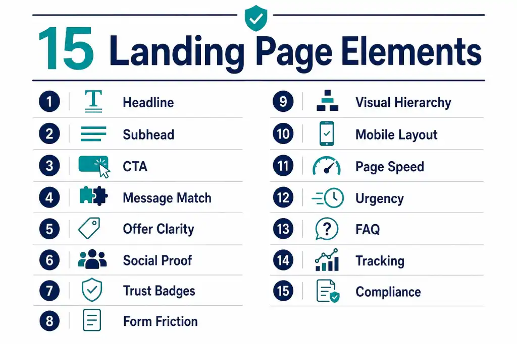
Optimization is also different from adding more copy. Many underperforming pages already have enough words. They lack hierarchy, speed, or a single obvious next step. The fifteen elements below are ordered roughly by how often they unblock conversions in practice. Your audit may reorder them based on data.
How Landing Pages Fit Into Affiliate and Partner Programs
Program operators often blame partners when CR drops. Partners often blame the offer. Frequently the issue sits between the click and the conversion: the landing experience. Message match fails when an affiliate promotes "30% off forever" and the page shows a 14-day trial. Attribution fails when the thank-you page never fires. Mobile fails when the CTA sits below three screens of stock photography.
Strong programs treat landing pages as shared infrastructure. Provide approved templates, deep-link parameters, and clear creative guidelines. Use features described in Enhancing Affiliate Marketing Strategies with Smart Links and A/B Testing on Tracknow so partners can route traffic to variants without inventing their own non-compliant pages.
Publishers and media buyers should map each traffic source to a dedicated lander when possible. Cold paid traffic needs more education above the fold. Warm email traffic can skip to a shorter form. Building How to Build High-Converting Affiliate Funnels starts with this source-to-page mapping — not with random A/B tests.
The 15 Elements That Boost Conversion Rates
1. Headline that states the outcome
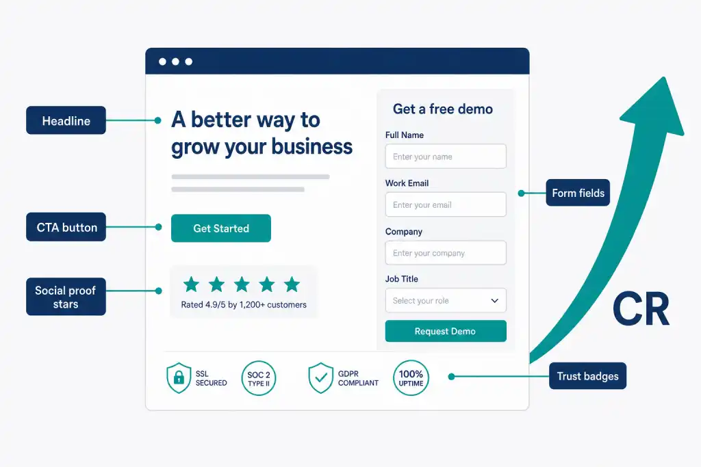
The headline must answer: what do I get, and for whom? Vague slogans ("Unlock your potential") underperform specific outcomes ("Track affiliate commissions in one dashboard"). Keep the primary keyword natural if the page ranks for SEO, but clarity beats cleverness for paid and affiliate traffic.
2. Supporting subheadline that removes doubt
One short line under the headline should clarify who the offer is for and what happens next. Example: "Built for SaaS founders launching partner programs — set up in a day, no developer queue." Subheads fail when they repeat the headline or introduce a second, competing offer.
3. Primary CTA above the fold
Visitors should not hunt for the action button. Use action-oriented copy ("Start free trial," "Get the bonus," "Compare odds") rather than "Submit" or "Learn more" when the conversion is the trial or signup. Keep one primary CTA style; secondary links can exist but should look quieter.
4. Message match from the affiliate link or ad
Whatever promise drove the click must appear on the page within seconds. If a partner promotes a World Cup kit sale, the lander must show kits and prices — not a generic homepage carousel. Broken message match is one of the fastest ways to inflate bounce rate and destroy partner EPC.
5. Offer clarity: price, bonus, and terms
State what the visitor receives, what it costs, and any material conditions. Hide-the-asterisk tactics may inflate short-term CR and then spike refunds or compliance flags. For regulated offers (finance, iGaming, health), show key terms near the CTA, not only in a footer PDF.
6. Social proof that matches the audience
Reviews, ratings, case snippets, and "trusted by" logos work when they are relevant. A B2B SaaS lander benefits from peer logos and short ROI stories. A consumer ecommerce lander benefits from recent buyer reviews. Fake or unrelated logos erode trust faster than no logos at all.
7. Trust badges and security signals
Payment icons, SSL cues, privacy notes, and industry certifications reduce anxiety on forms and checkout. Place them near the CTA or form, not only in the footer. For affiliate programs, clarifying "official partner" status can reduce suspicion when traffic arrives from third-party content.
8. Form and friction design
Every extra field costs conversions. Ask only for data you will use at this step. Multi-step forms can outperform long single pages when each step feels light. Show progress. Explain why you need a phone number if you ask for it. Autofill-friendly labels help on mobile.
9. Visual hierarchy and scannability
Most visitors scan. Use short paragraphs, bullet benefits, and clear section headers. Avoid walls of text above the first CTA. Hero images should support the offer — product UI, outcome photo, or simple diagram — not decorative stock that competes with the CTA for attention.
10. Mobile-first layout
Affiliate traffic is often majority mobile, especially from social, messaging, and creator links. Thumb-reach CTAs, readable type without pinch-zoom, and single-column layouts are mandatory. Sticky mobile CTAs help when the page is long — but never cover form fields or cookie banners that block taps.
11. Page speed and Core Web Vitals
Slow pages lose impatient traffic before your value proposition loads. Compress images (WebP under sensible weight caps), defer non-critical scripts, and avoid heavy carousels above the fold. Speed is a conversion feature, not an IT nicety. Measure on real mid-range phones, not only office Wi-Fi laptops.
12. Relevant urgency and scarcity — used honestly
Timers and limited bonuses can lift CR when they are true. Fake countdown clocks that reset on refresh train users to distrust you. Prefer real campaign end dates synced with your affiliate promo calendar. Urgency without proof is a trust leak.
13. Objection-handling FAQ near the CTA
A compact FAQ answering shipping, payout, cancellation, geo eligibility, or "is this the official site?" questions reduces support load and hesitation. Place it after the main offer, not as a replacement for clear offer copy. Keep answers short and factual.
14. Tracking, pixels, and thank-you events
Confirm that click IDs, sub-IDs, and conversion events fire on the correct pages. Test with real partner links before scaling spend. Server-to-server postbacks often outperform client-only pixels when browsers restrict cookies. Misconfigured tracking makes optimized pages look like failures in partner dashboards.
15. Compliance and disclosure blocks
Affiliate disclosures, age gates, restricted geo notices, and accurate claims protect the brand and the partners. Compliance copy should be visible without burying the CTA in legal walls. Non-compliant landers get traffic sources shut down — no amount of headline testing recovers that.
A Practical Optimization Framework
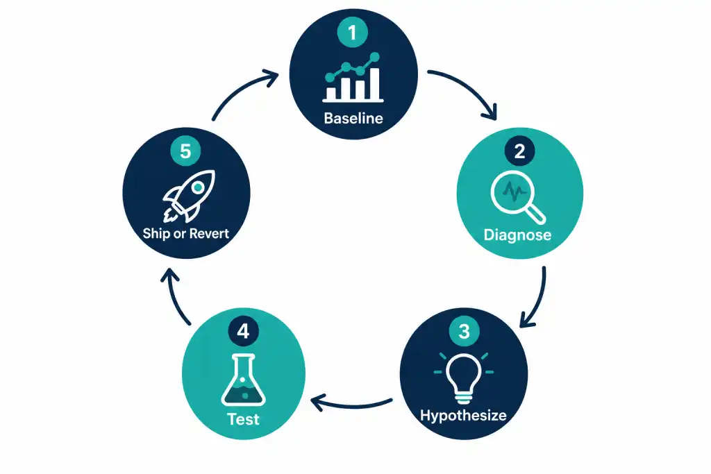
Use a simple loop so you do not optimize randomly:
- Baseline — Capture CR, EPC, bounce rate, and device split for 7–14 days on the current page.
- Diagnose — Watch session recordings or heatmaps if available; note where users stall (form, CTA, scroll depth).
- Hypothesize — Pick one primary hypothesis tied to one element (e.g., "A benefit-led headline will improve CR on mobile paid traffic").
- Test — Run A/B Testing for Affiliate Campaigns with enough traffic for a decision; avoid launching five simultaneous redesigns.
- Ship or revert — Keep winners, document losers, update partner creatives so message match stays intact.
When traffic volume is too low for clean A/B tests, use sequential changes with longer observation windows — or improve the highest-friction element first (usually mobile form or speed) based on qualitative evidence.
Mini scenario: SaaS free trial lander
A B2B SaaS affiliate program sees strong click volume from review sites but weak trial starts. Heatmaps show users reading the hero then bouncing. The team rewrites the headline to name the outcome, moves the CTA above the fold on mobile, and cuts the form from nine fields to four. Trial starts rise without changing commissions. Partners notice higher EPC and send more traffic — a virtuous cycle driven by the lander, not a payout increase.
Mini scenario: iGaming welcome offer
A sportsbook partner promotes a World Cup bonus. The lander leads with brand storytelling and buries the bonus terms. Bounce spikes from paid social. A compliant redesign puts the bonus amount, eligibility, and CTA above the fold, with terms accordion below. CR improves and compliance reviews pass because claims match the creative partners were given.
Mini scenario: Ecommerce kit sale
A merchandise affiliate drives traffic to a homepage during a tournament kit drop. Visitors see unrelated categories first. Switching to a deep-linked category lander with in-stock filters and kit photos lifts add-to-cart rate. The lesson: destination specificity beats brand homepage vanity for affiliate traffic.
Tools and Metrics to Watch
Track at minimum:
- Conversion rate by device, geo, and partner or sub-ID
- EPC so partners and operators share one economic view
- Bounce rate and scroll depth for diagnosis, not as vanity goals
- Form start vs form complete to isolate friction
- Page load metrics on mobile networks
- Attribution integrity — percentage of conversions with valid click IDs
Analytics tools (GA4, heatmaps, session replay) help diagnose. Affiliate platforms keep partner-level truth. Align both so a design win is visible to affiliates who decide where to send the next thousand clicks.
How to Measure Success
Success is not "the page looks modern." Success is a sustained improvement in CR and EPC for the same traffic quality — or holding CR while you scale volume. Segment results: a change that helps SEO blog traffic may hurt cold paid social. Keep variants mapped to traffic sources.
Revisit landers when you change pricing, creatives, geos, or compliance rules. Seasonal campaigns (major sports events, Black Friday, product launches) deserve dedicated templates rather than forcing evergreen pages to carry mismatched promises.
Common Mistakes (and How to Avoid Them)
Testing colors before fixing clarity. Button color tests rarely beat a clearer headline and CTA. Fix message match and offer clarity first.
Multiple primary CTAs. "Buy now," "Watch demo," and "Download PDF" competing above the fold splits attention. Pick one primary conversion for the page goal.
Ignoring partner message match. Approving affiliate ads that promise something the lander does not deliver creates refunds and disputes. Sync creative approval with page inventory.
Desktop-only design reviews. Approving landers on a large monitor hides mobile failures. Require mobile screenshots in every review.
Heavy scripts and autoplay video. They destroy speed and often block interaction on low-end devices. Use video only when it clearly lifts understanding.
No tracking QA. Shipping a redesign that drops the conversion pixel looks like a CRO win in analytics until finance notices missing attributed sales.
Fake scarcity. Resetting timers trains distrust. Use real campaign deadlines.
Optimizing for clicks on the lander instead of the offer conversion. Soft CTAs to another article may raise engagement metrics while killing affiliate CR. Align the page goal with the paid event.
Conclusion
Landing page optimization for affiliate offers is a practical checklist, not a redesign cult. Fifteen elements — from headline and CTA to speed, tracking, and compliance — give you a shared language between marketers, partners, and developers. Improve the highest-friction items first, test with discipline, and keep message match intact whenever creatives change.
When your pages convert, affiliates send more traffic, CAC improves, and seasonal campaigns become scalable instead of chaotic. Pair strong landers with reliable partner tracking and reporting so every test is visible in the same system partners trust.
If you are building or scaling a partner program and need flexible tracking, smart links, and reporting that keep landing page tests honest across affiliates, Tracknow is a strong place to start.
FAQ
What is the difference between a landing page and a homepage for affiliate traffic?
A homepage serves many audiences and goals. A landing page serves one campaign promise and one primary conversion. Affiliate traffic usually converts better on dedicated landers or deep links that match the ad or content angle. Use the homepage only when it already matches that promise above the fold.
How many landing page elements should I change at once?
Change one major element at a time when you need clear learning — headline, CTA, or form length. Bundle only when traffic is too low for sequential tests and the page is obviously broken (e.g., unreadable on mobile). Document what shipped so you can attribute results.
Do I need different landers for each affiliate?
Not always. You need message match and clean tracking per partner. That can mean shared templates with unique sub-IDs, or separate pages for major partners and traffic types. High-volume partners often justify dedicated variants.
What conversion rate should I expect?
CR varies widely by vertical, geo, device, and traffic temperature. Use your own baseline rather than generic industry averages. Judge success by relative improvement and EPC, not by matching someone else's published percentage.
Should affiliates host their own pre-landers?
Only if your program allows it and you can review compliance. Pre-landers can improve message match for cold traffic but also introduce claim risk and tracking complexity. Many brands prefer approved templates hosted on first-party domains.
How important is page speed for affiliate landers?
Critical on mobile and paid social. If the hero and CTA take several seconds to become interactive, you lose the visitors least patient — often the same paid traffic you paid to acquire. Treat speed budgets as part of the CRO brief.
Where should trust badges go?
Near the decision point: beside the CTA or under the form. Footer-only badges help little for visitors who never scroll. Keep badges accurate — expired certificates and unrelated logos hurt credibility.
How do I optimize for both SEO and paid affiliate traffic?
SEO pages need richer content and internal links; paid landers need ruthless focus. Sometimes one URL serves both; often you maintain a content hub for SEO and a shorter conversion page for paid and partner traffic, linked carefully to avoid confusing attribution.
What tools help with landing page testing?
Use your analytics suite for funnels, a testing tool or smart-link routing for variants, and heatmap or session tools for qualitative clues. Affiliate software should report CR and EPC by partner so design wins show up in partner economics.
When should I redesign the whole page?
When the layout cannot support mobile CTAs, when brand or offer positioning has changed completely, or when technical debt blocks speed fixes. Otherwise, iterative element-level optimization usually beats a full redesign that mixes too many variables.
10-Point Checklist for Landing Page Optimization for Affiliate Offers
- One primary conversion goal defined and tracked as the affiliate payout event.
- Headline and subhead state the outcome and audience in plain language.
- Primary CTA visible above the fold on mobile and desktop.
- Message match verified against live partner creatives and ads.
- Offer price, bonus, and material terms shown clearly near the CTA.
- Social proof and trust signals relevant to the traffic source.
- Form fields minimized; mobile keyboard and autofill tested.
- Page speed acceptable on a mid-range phone over typical mobile network conditions.
- Click IDs, pixels, and thank-you events QA-tested with a real partner link.
- Compliance disclosures and geo/age rules visible without breaking the conversion path.